Typography is an essential part of Anaplan’s visual identity. The way we use type impacts how we deliver our brand message. Through font weights and type hierarchy we guide the way our communication is understood.
Inter
We use Inter as our corporate font. It is a modern, highly legible, and approachable sans-serif font. The font family offers a variety of weights that are useful in establishing type hierarchy. We primarily use Inter Light and Inter Medium. Inter is suitable for digital and print.
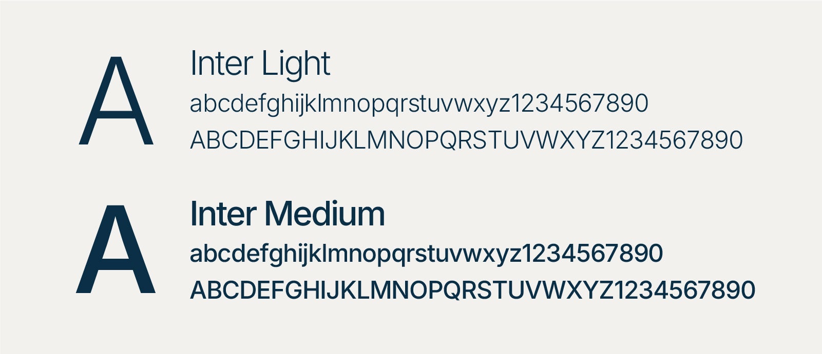
Inter is a Google font. You can download and start using Inter here.
Arial
Arial is a system-safe font that we use for Microsoft applications and email. Use Arial as you would use Inter for establishing type hierarchy.
Type hierarchy
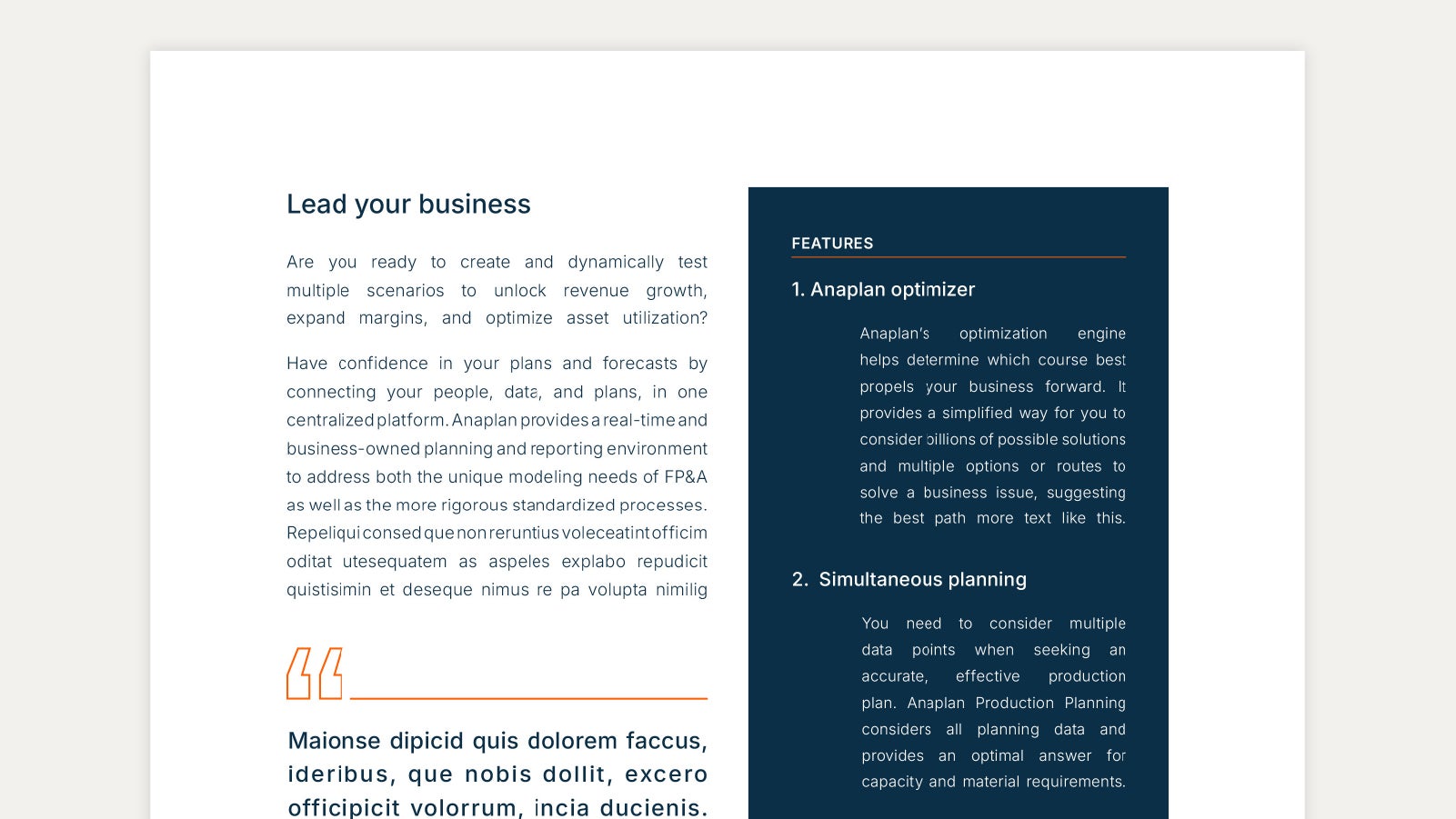
Maintaining a clear typographic hierarchy is crucial for ensuring content is organized and easy to read.
Eyebrows are uppercase and semibold weight.
Headlines are sentence case and medium weight.
Subheadlines are sentence case and either medium or light weight. They need to be smaller than the headline but larger than the body copy.
Body copy is in sentence case and light weight.
URLs and hyperlinks are all lowercase, medium weight, and purple.
Disclaimers should be the smallest but must be a sufficient size to be clearly readable.
Typography guidelines
Do not use any other typeface other than Inter or Arial.

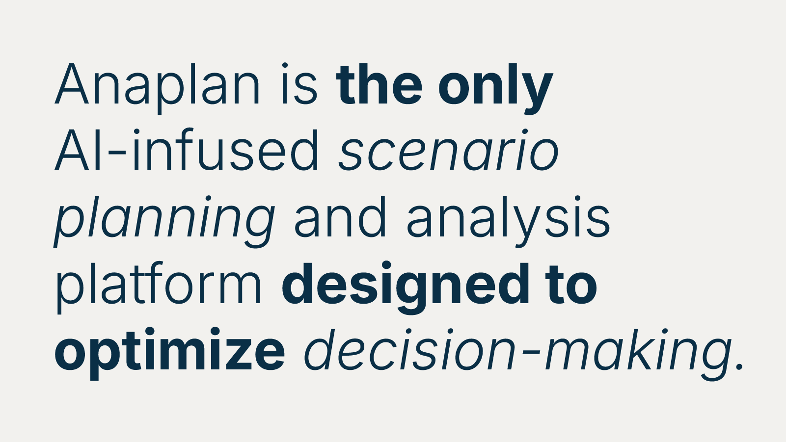
Avoid overusing Bold and Italic font styles. These styles should be used for emphasis and overuse can make the design feel cluttered and reduce overal readability.
Do not place text over a busy background.

Do not use incorrect leading or tracking.
Do not add drop shadows to typography.

Do not fully justify paragraphs.