Our logo is the initial identifier for our company. It’s a symbol that represents our values and principles. It’s our signature and way of saying, “Hello, we’re Anaplan.” Just as you always sign your name the same way, always use the Anaplan logo with consistency.
Anaplan’s visual identity includes two primary logo forms: the wordmark (full Anaplan name) and the lettermark (A-based monogram). Both are essential assets that help maintain consistency while offering flexibility across various applications.
Wordmark (full logo)
The wordmark is the preferred representation of our brand and should be used in most external-facing materials where clarity, brand recognition, and professionalism are key.

Use on light background images.

Use on dark background images.
Use for black and white printing only.

Use the wordmark when:
- Introducing the brand to new audiences
- On prominent placement like website headers, presentations, press releases, and official documents
- In large-scale formats where legibility isn’t an issue (e.g., signage, trade show booths, branded videos)
- For formal partnerships or co-branded materials
Anaplan wordmark guidelines
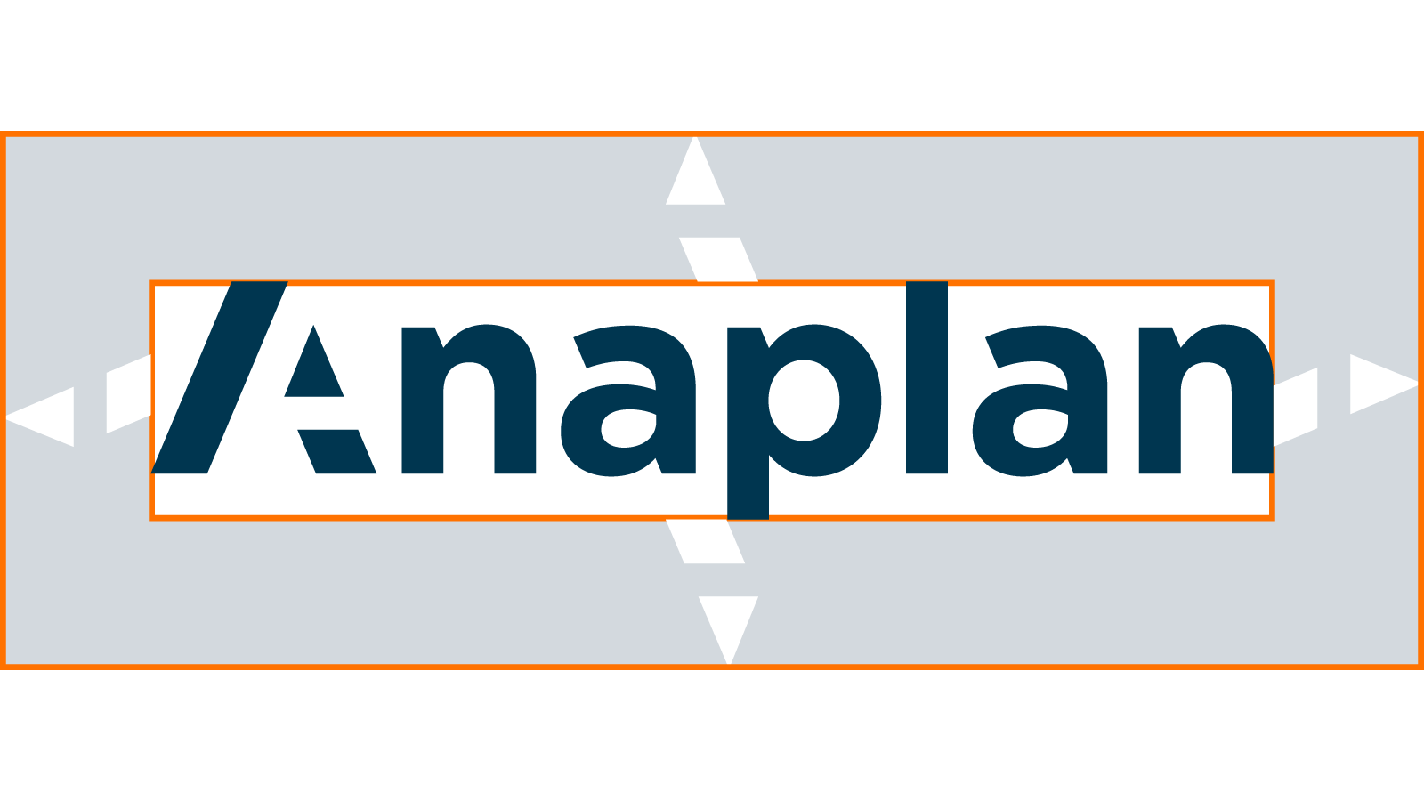
The clear space around our wordmark should be equal to the height of the triangle and the trapezoid that make up the right half of the Anaplan “A” lettermark.
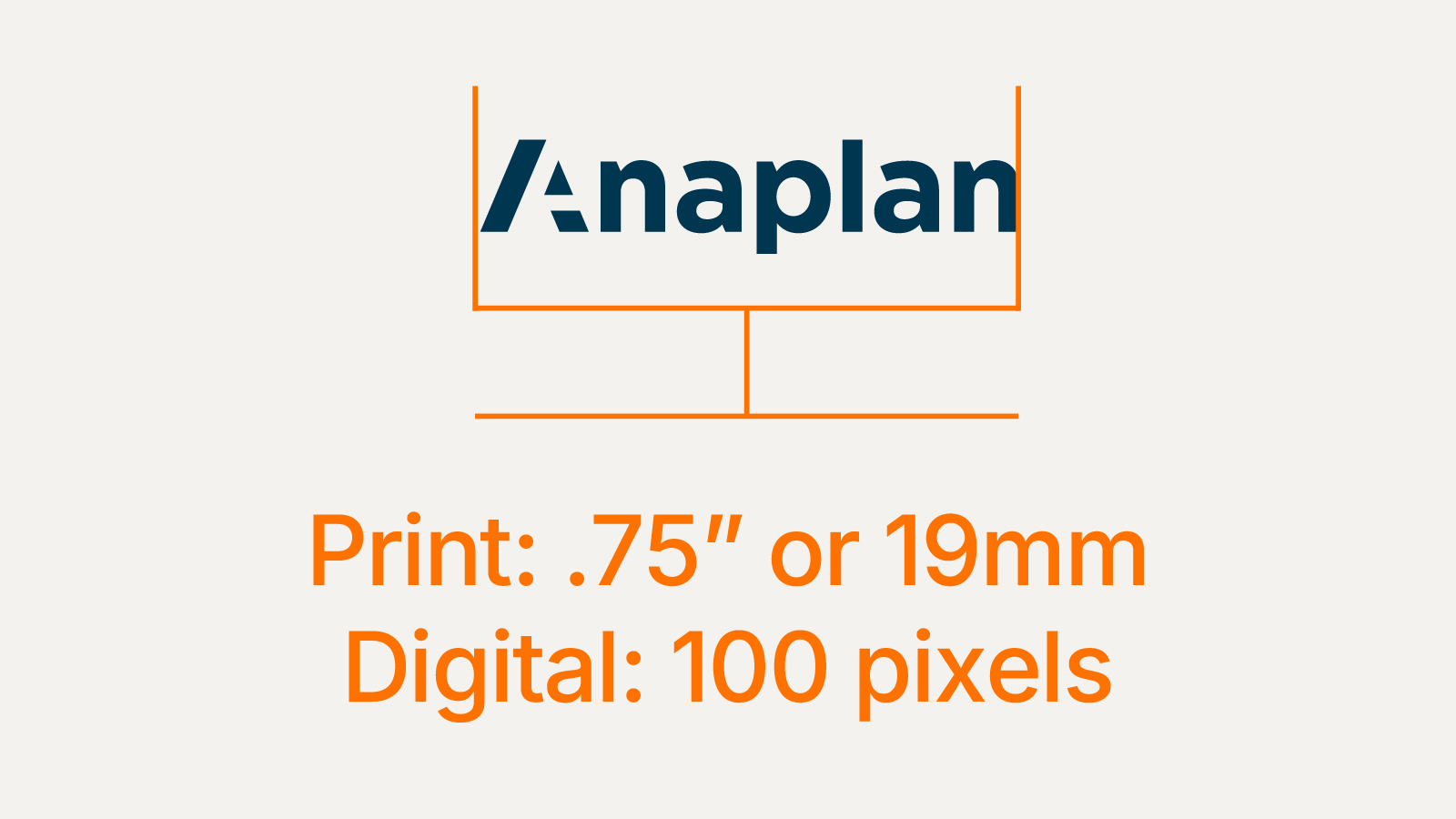
Minimum wordmark size
Never stretch, compress, warp, or transform any part of the wordmark.
Never crop any part of the wordmark.
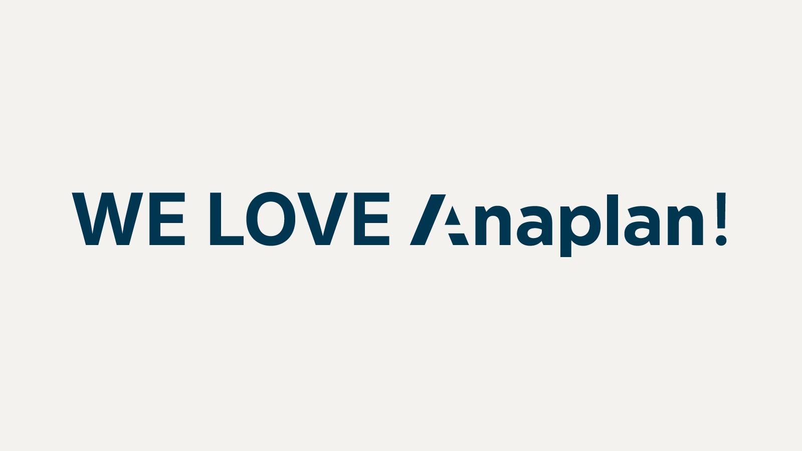
Never use the wordmark within a sentence.
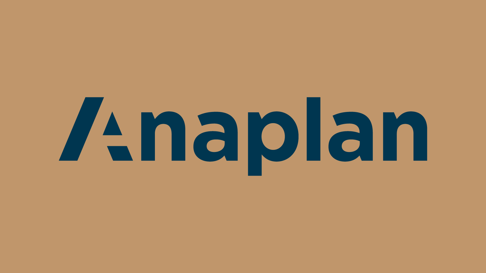
Never use the wordmark over any color that doesn’t complement or is a part of the color palette.
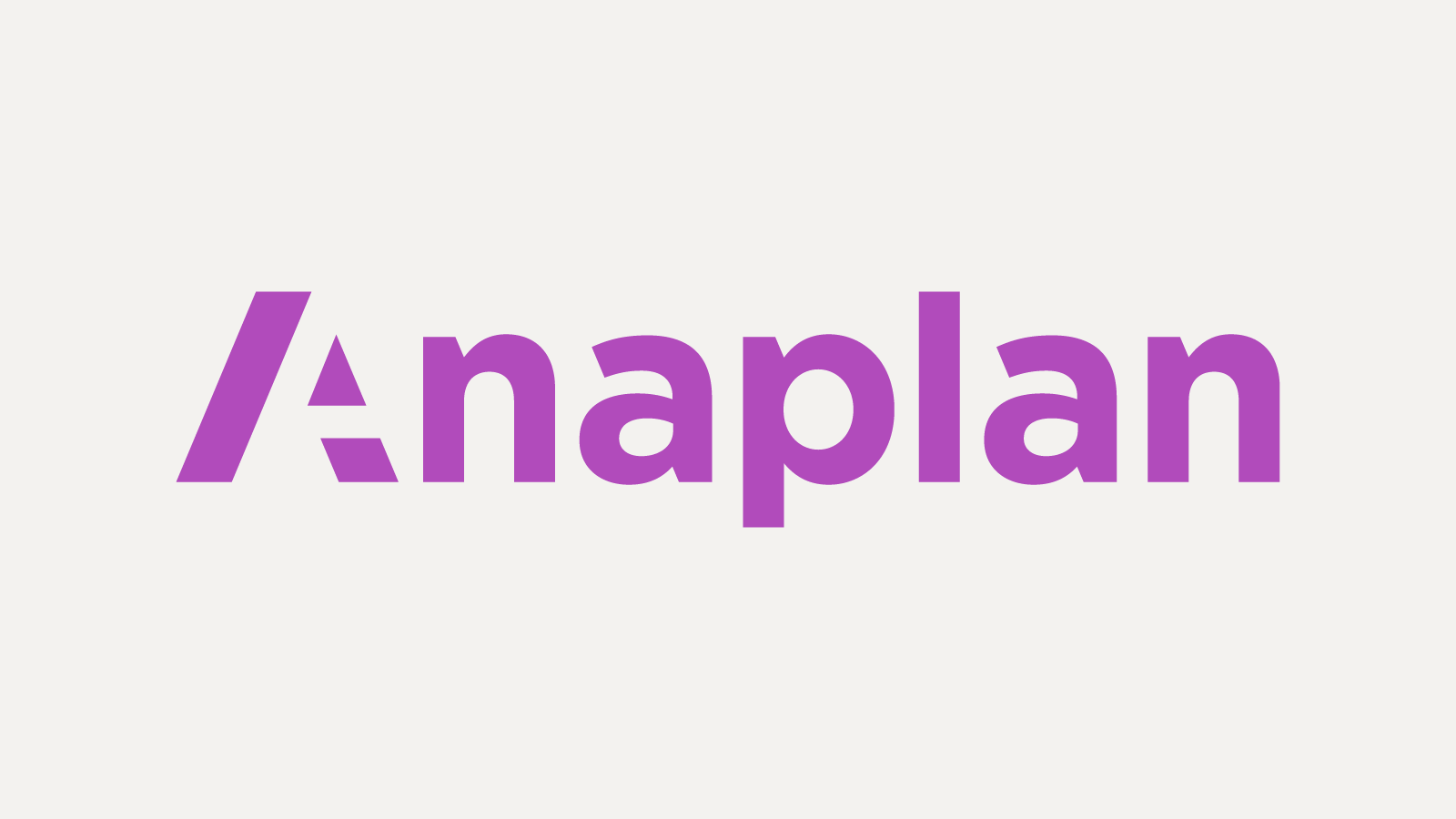
Never alter the color of the wordmark in anything other than the specified colors above.
Never use any type of effects such as drop shadows, glows, etc. with the wordmark.
Lettermark (A)
The lettermark is a simplified version of our logo, designed for versatility in constrained spaces. It serves as a visual shorthand for the brand once recognition has been established.


Use the lettermark when:
- Space is limited and the wordmark would become illegible (e.g., favicons, app icons, social media avatars, small merchandise)
- As a subtle brand indicator in layouts where the wordmark already appears prominently
- On internal documents, tools, or platforms familiar to the audience
- For watermarking visual assets or subtle branding elements
Anaplan lettermark guidelines
Use proper clear space.

Never use the lettermark within a word or a sentence.
Never use over any color that doesn’t complement or is part of the color palette.

Combined usage
In rare cases, both the wordmark and lettermark may appear together to reinforce branding. This is typically done when introducing the lettermark in new contexts where additional clarity is needed (e.g., first-time use in product UIs or during rebranding transitions).
Do not substitute the lettermark in place of the wordmark where full brand clarity is essential.

Do not use both marks redundantly in the same visual space unless explicitly specified in a design system pattern.
