Icons add helpful visual cues to our content. Use them as supporting design elements and never as a primary design element. Our icons should feel like they are all drawn from the same hand. It's essential that the style and line weight are consistent across every icon.
Our icons can be used in two colors: ink or white.
If you need a different icon than the ones provided, please reach out to the Anaplan Design Team.
Iconography style
Simplicity
Icons should be straightforward and easy to understand at a glance. They should be a visual representation that is immediately recognizable.
Use simple shapes and minimal detail.

Use excessive detail or complex shapes.

Consistency
All Anaplan icons should follow a consistent design aesthetic that reflects our sophisticated and professional identity. Each icon must be designed with a minimal, modern approach that feels polished and refined.
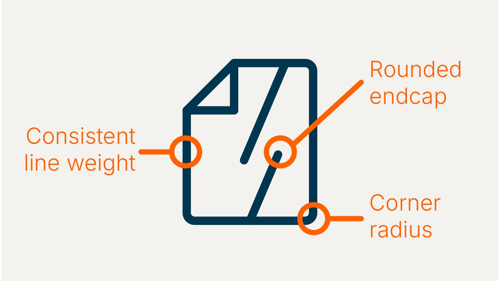
Always use the same line styles when creating icons, such as line weight, corner radius, and rounded endcaps.
Do not change the style of the icons.

Do not change line weight throughout one icon.

Perspective
Only create icons that appear to be straight on or from a profile.
Create icons that look 2D.

Do not create icons that look 3D.

Color
Only create icons in ink or white and make sure the background has enough contrast with the icon.
Do not change the color of icon.
Do not use a background with low contrast to the icon.

Do not apply any effects to the icons such as drop shadows or gradients.

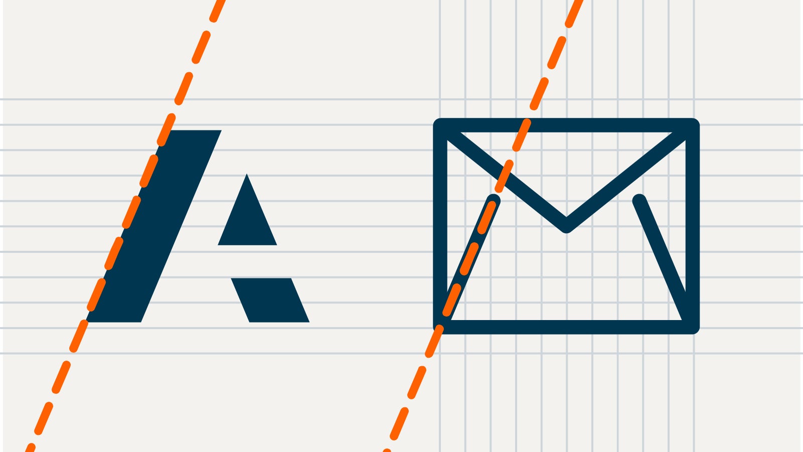
Anaplan angle
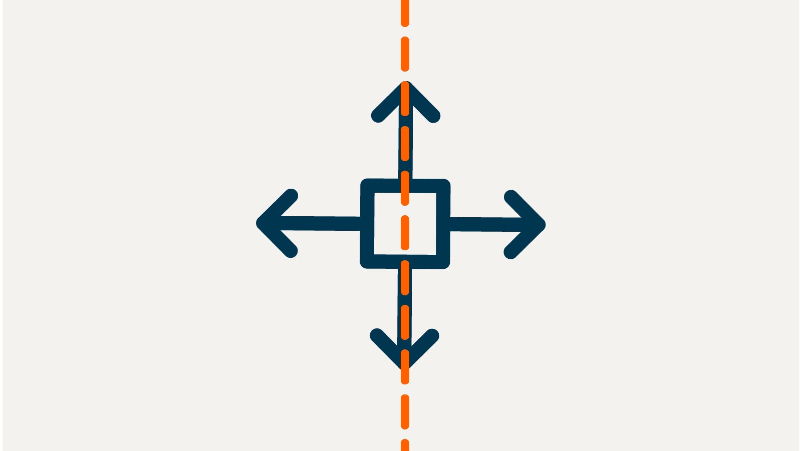
Every icon must incorporate the 67° angle used in the “A” of the Anaplan logo. This feature reinforces the brand identity and gives the icon a unique feature.
Apply the angle in a subtle way.
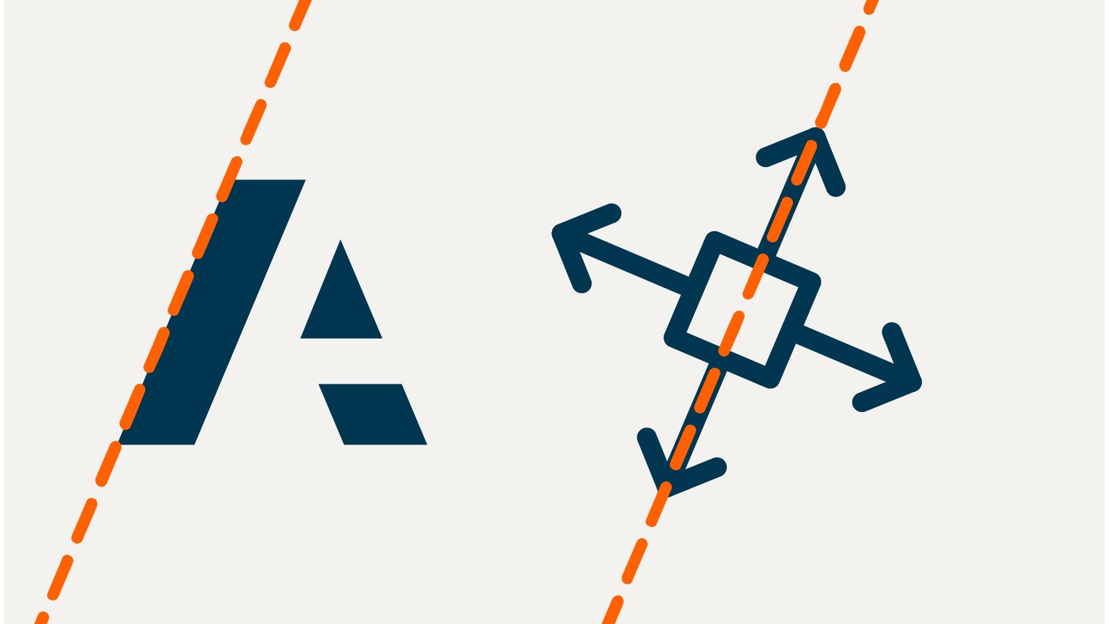
Do not create an icon without the angle from the "A" of the Anaplan logo.
How to create icons
Use a 10mm x 10mm square grid as the base to create icons. Align icon elements to the grid.
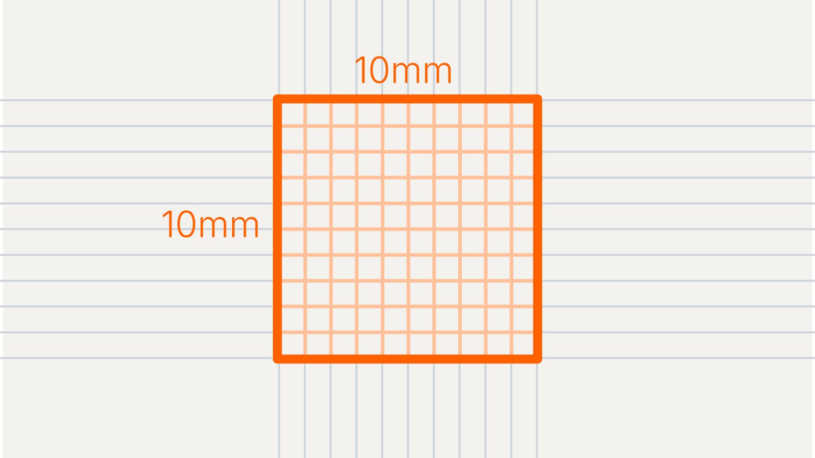
Use a consistent 1.6pt stroke weight.

Use a corner radius of .5mm.

Use a rounded endcap on all lines.

Always use the 67° angle of the Anaplan "A" somewhere within every icon.