Color helps to create a first impression with our brand. It also builds ongoing brand recognition. Understanding how to use our colors is an integral part of our brand expression.
We have two color palettes: foundational and core. Use these colors in the correct ratios to ensure our visual identity remains balanced and professional.
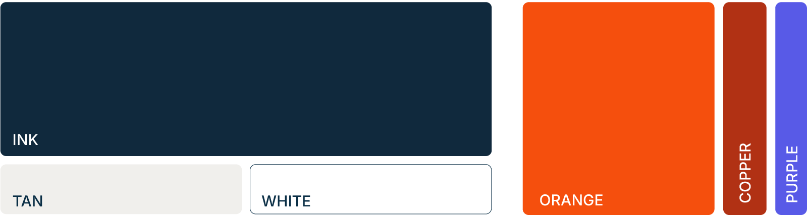
Foundational palette
The foundational color palette is the anchor of Anaplan’s visual identity. These colors should be used predominately across all brand assets to maintain a cohesive brand presence.
Ink
Tan
White
Core palette
The secondary color palette consists of colors that can be used with the foundational palette to create our Anaplan brand. These colors should be used minimally, and only as accents with the foundational Palette.
Orange
Copper
Purple
Extended palettes
Tints are available for foundational and core colors to give more flexibility.
Ink
Ink Tint 1
Reference:ink-tint-1Ink Tint 2
Reference:ink-tint-2Ink Tint 3
Reference:ink-tint-3Ink Tint 4
Reference:ink-tint-4Ink Tint 5
Reference:ink-tint-5Ink Tint 6
Reference:ink-tint-6
Orange
Orange Tint 1
Reference:orange-tint-1Orange Tint 2
Reference:orange-tint-2Orange Tint 3
Reference:orange-tint-3Orange Tint 4
Reference:orange-tint-4Orange Tint 5
Reference:orange-tint-5Orange Tint 6
Reference:orange-tint-6
Copper
Copper Tint 1
Reference:copper-tint-1Copper Tint 2
Reference:copper-tint-2Copper Tint 3
Reference:copper-tint-3Copper Tint 4
Reference:copper-tint-4Copper Tint 5
Reference:copper-tint-5Copper Tint 6
Reference:copper-tint-6
Purple
Purple Tint 1
Reference:purple-tint-1Purple Tint 2
Reference:purple-tint-2Purple Tint 3
Reference:purple-tint-3Purple Tint 4
Reference:purple-tint-4Purple Tint 5
Reference:purple-tint-5Purple Tint 6
Reference:purple-tint-6
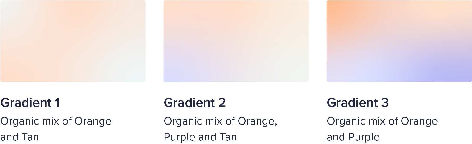
Gradients
Gradients provide additional depth and dimension to the brand and should be used sparingly and with intent. The gradients should be used to enhance specific design elements or create subtle backgrounds.
Color guidelines
Use proper contrast especially with text to ensure legibility and accessibility to all viewers.

Avoid using copper and purple as the main color. Always keep the foundational colors as the primary colors.

Download swatches
If you're designing using the Adobe software, please download and use these swatches in RGB or CMYK depending on your final assets type.